State timeline
A state timeline visualization displays data in a way that shows state changes over time. In a state timeline, the data is presented as a series of bars or bands called state regions. State regions can be rendered with or without values, and the region length indicates the duration or frequency of a state within a given time range.
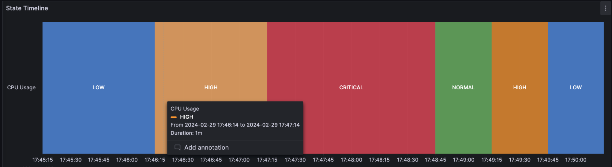
For example, if you’re monitoring the CPU usage of a server, you can use a state timeline to visualize the different states, such as “LOW,” “NORMAL,” “HIGH,” or “CRITICAL,” over time. Each state is represented by a different color and the lengths represent the duration of time that the server remained in that state:
The state timeline visualization is useful when you need to monitor and analyze changes in states or statuses of various entities over time. You can use one when you need to:
-
Monitor the status of a server, application, or service to know when your infrastructure is experiencing issues over time.
-
Identify operational trends over time.
-
Spot any recurring issues with the health of your applications.
Supported data formats
The state timeline visualization works best if you have data capturing the various states of entities over time, formatted as a table. The data must include:
-
Timestamps - Indicate when each state change occurred. This could also be the start time for the state change. You can also add an optional timestamp to indicate the end time for the state change.
-
Entity name/identifier - Represents the name of the entity you’re trying to monitor.
-
State value - Represents the state value of the entity you’re monitoring. These can be string, numerical, or boolean states.
Each state ends when the next state begins or when there is a null value.
Examples
The following tables are examples of the type of data you need for a state timeline visualization and how it should be formatted.
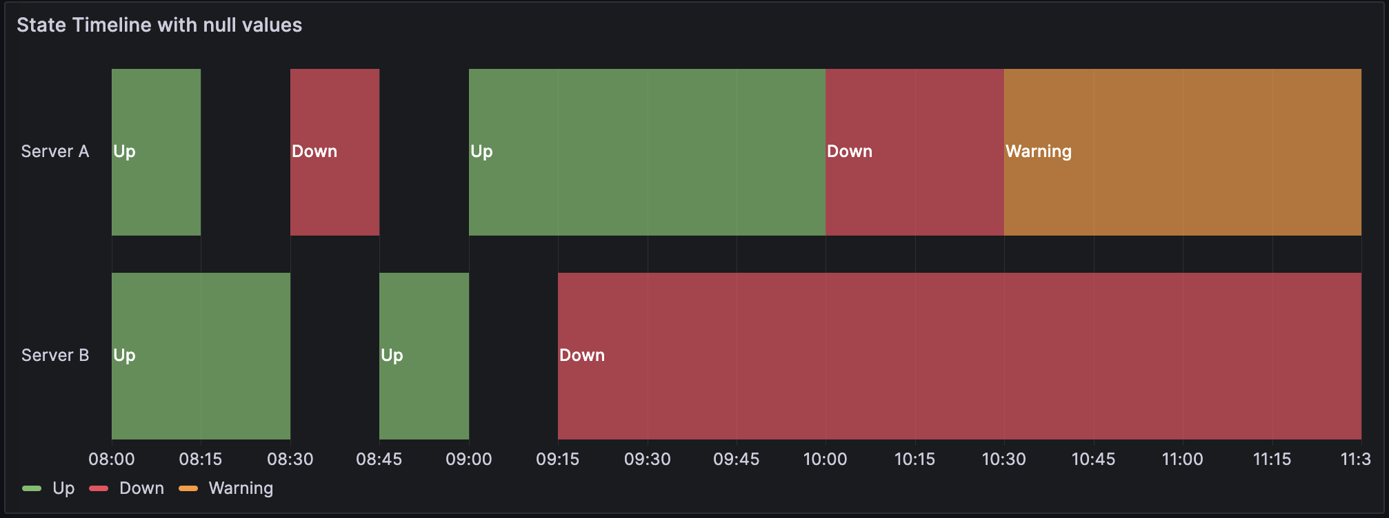
Single time column with null values
| Timestamps | Server A | Server B |
|---|---|---|
2024-02-29 8:00:00 |
Up |
Up |
2024-02-29 8:15:00 |
null |
Up |
2024-02-29 8:30:00 |
Down |
null |
2024-02-29 8:45:00 |
Up |
|
2024-02-29 9:00:00 |
Up |
|
2024-02-29 9:15:00 |
Up |
Down |
2024-02-29 9:30:00 |
Up |
Down |
2024-02-29 10:00:00 |
Down |
Down |
2024-02-29 10:30:00 |
Warning |
Down |
The data is converted as follows, with the null and empty values visualized as gaps in the state timeline:
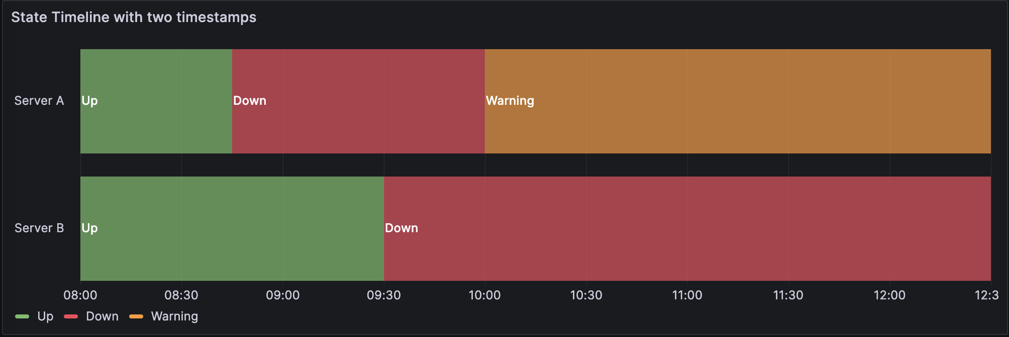
Two time columns without null values
| Start time | End time | Server A | Server B |
|---|---|---|---|
2024-02-29 8:00:00 |
2024-02-29 8:15:00 |
Up |
Up |
2024-02-29 8:15:00 |
2024-02-29 8:30:00 |
Up |
Up |
2024-02-29 8:45:00 |
2024-02-29 9:00:00 |
Down |
Up |
2024-02-29 9:00:00 |
2024-02-29 9:15:00 |
Down |
Up |
2024-02-29 9:30:00 |
2024-02-29 10:00:00 |
Down |
Down |
2024-02-29 10:00:00 |
2024-02-29 10:30:00 |
Warning |
Down |
The data is converted as follows:
If your query results aren’t in a table format like the preceding examples, especially for time-series data, you can apply specific transformations to achieve this.
State timeline options
Use these options to refine the visualization.
Merge equal consecutive values
Controls whether Grafana merges identical values if they are next to each other.
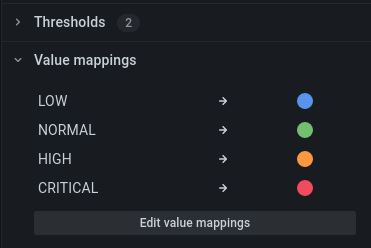
Value mappings
To assign colors to boolean or string values, you can use Value mappings.
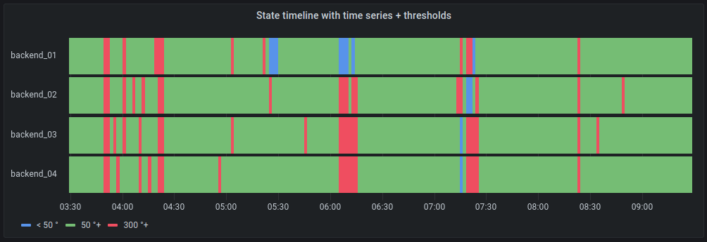
Time series data with thresholds
The visualization can be used with time series data as well. In this case, the thresholds are used to turn the time series into discrete colored state regions.
Legend options
Unresolved directive in state-timeline.adoc - include::../{root_path}shared/visualizations/legend-options-2.adoc[]
Tooltip options
Unresolved directive in state-timeline.adoc - include::../{root_path}shared/visualizations/tooltip-options-1.adoc[]
Data links
Unresolved directive in state-timeline.adoc - include::../{root_path}shared/visualizations/datalink-options.adoc[]
Thresholds
Unresolved directive in state-timeline.adoc - include::../{root_path}shared/visualizations/thresholds-options-2.adoc[]