Stat
NOTE: This visualization replaces the Singlestat visualization, which was deprecated in Grafana 7.0 and removed in Grafana 8.0.
A stat visualization displays your data in single values of interest—such as the latest or current value of a series—with an optional graph sparkline. A graph sparkline, which is only available in stat visualizations, is a small time-series graph shown in the background of each value in the visualization.
For example, if you’re monitoring the utilization of various services, you can use a stat visualization to show their latest usage:

Use a stat visualization when you need to:
-
Monitor key metrics at a glance, such as the latest health of your application, number of high priority bugs in your application, or total number of sales.
-
Display aggregated data, such as the average response time of your services.
-
Highlight values above your normal thresholds to quickly identify if any metrics are outside your expected range.
Configure a stat visualization
Once you’ve created a dashboard, the following video shows you how to configure a stat visualization:
Alternatively, refer to this blog post on how to easily retrieve values from a range in Grafana using a stat visualization.
Supported data formats
The stat visualization supports a variety of formats for displaying data. Supported formats include:
-
Single values - The most common format and can be numerical, strings, or boolean values.
-
Time-series data - Calculation types can be applied to your time-series data to display single values over a specified time range.
Examples
The following tables are examples of the type of data you need for a stat visualization and how it should be formatted.
Single numerical values
| Number of high priority bugs |
|---|
80 |
52 |
59 |
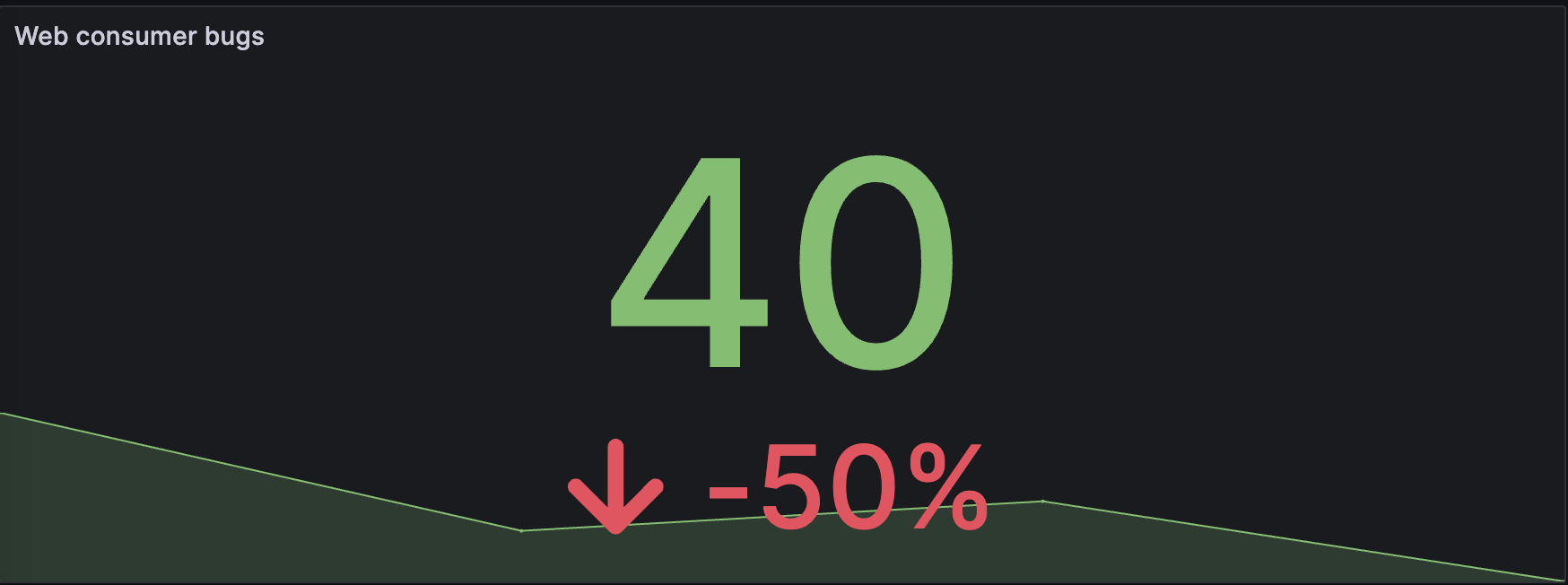
40 |
The data is visualized as follows, with the last value displayed, along with a sparkline and percentage change:

Time-series data
| Time | Cellar | Living room | Porch | Bedroom | Guest room | Kitchen |
|---|---|---|---|---|---|---|
2024-03-20 06:34:40 |
12.3 |
18.3 |
18.8 |
15.9 |
9.29 |
9.61 |
2024-03-20 06:41:40 |
16.8 |
17.1 |
21.5 |
14.1 |
10.5 |
17.5 |
2024-03-20 06:48:40 |
16.7 |
18.0 |
21.0 |
9.51 |
13.6 |
20.1 |
2024-03-20 06:55:40 |
14.3 |
18.7 |
16.5 |
9.11 |
14.8 |
12.5 |
2024-03-20 07:02:40 |
12.8 |
15.2 |
21.1 |
15.6 |
7.98 |
13.0 |
The data is visualized as follows, with the mean value displayed for each room, along with the room name, sparkline, and unit of measurement:

By default, a stat displays one of the following:
-
Just the value for a single series or field.
-
Both the value and name for multiple series or fields.
You can use the Text mode to control how the text is displayed.
Automatic layout adjustment
The panel automatically adjusts the layout depending on available width and height in the dashboard. It automatically hides the graph (sparkline) if the panel becomes too small.
Value options
Use the following options to refine how your visualization displays its values:
Show
Display a single value per column or series, or show values for each row.
Calculate
Display a calculated value based on all rows.
-
Calculation - Select a reducer function that Grafana will use to reduce many fields to a single value. For a list of available calculations, refer to Calculation types.
-
Fields - Select the fields display in the visualization.
Stat styles
Style your visualization.
Orientation
Choose a stacking direction.
-
Auto - Grafana selects what it thinks is the best orientation.
-
Horizontal - Bars stretch horizontally, left to right.
-
Vertical - Bars stretch vertically, top to bottom.
Text mode
You can use the Text mode option to control what text the visualization renders. If the value is not important, only the name and color is, then change the Text mode to Name. The value will still be used to determine color and is displayed in a tooltip.
-
Auto - If the data contains multiple series or fields, show both name and value.
-
Value - Show only value, never name. Name is displayed in the hover tooltip instead.
-
Value and name - Always show value and name.
-
Name - Show name instead of value. Value is displayed in the hover tooltip.
-
None - Show nothing (empty). Name and value are displayed in the hover tooltip.
Wide layout
Set whether wide layout is enabled or not. Wide layout is enabled by default.
-
On - Wide layout is enabled.
-
Off - Wide layout is disabled.
NOTE: This option is only applicable when Text mode is set to Value and name. When wide layout is enabled, the value and name are displayed side-by-side with the value on the right, if the panel is wide enough. When wide layout is disabled, the value is always rendered underneath the name.
Color mode
Select a color mode.
-
None - No color applied to the value.
-
Value - Applies color to the value and graph area.
-
Background Gradient - Applies color to the value, graph area, and background, with a slight background gradient.
-
Background Solid - Applies color to the value, graph area, and background, with a solid background color.
Graph mode
Select a graph and sparkline mode.
-
None - Hides the graph and only shows the value.
-
Area - Shows the area graph below the value. This requires that your query returns a time column.
Text size
Adjust the sizes of the gauge text.
-
Title - Enter a numeric value for the gauge title size.
-
Value - Enter a numeric value for the gauge value size.
Data links
Unresolved directive in stat.adoc - include::{root_path}shared/visualizations/datalink-options.adoc[]
Thresholds
Unresolved directive in stat.adoc - include::../{root_path}shared/visualizations/thresholds-options-2.adoc[]